Sometimes the best costuming is the costuming you don’t notice. The role of costuming is to help establish the world, and set the mood of the story. At its best, costuming is giving you information about the characters that you won’t realize you’re getting.
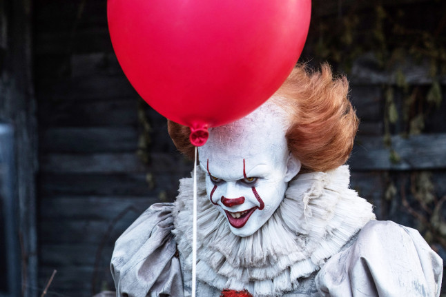
It (2017) is a great example of storytelling in costume design. I watched it last night and loved how masterful and subtle the costuming was. It’s fantastic. So let’s talk about It today, shall we?
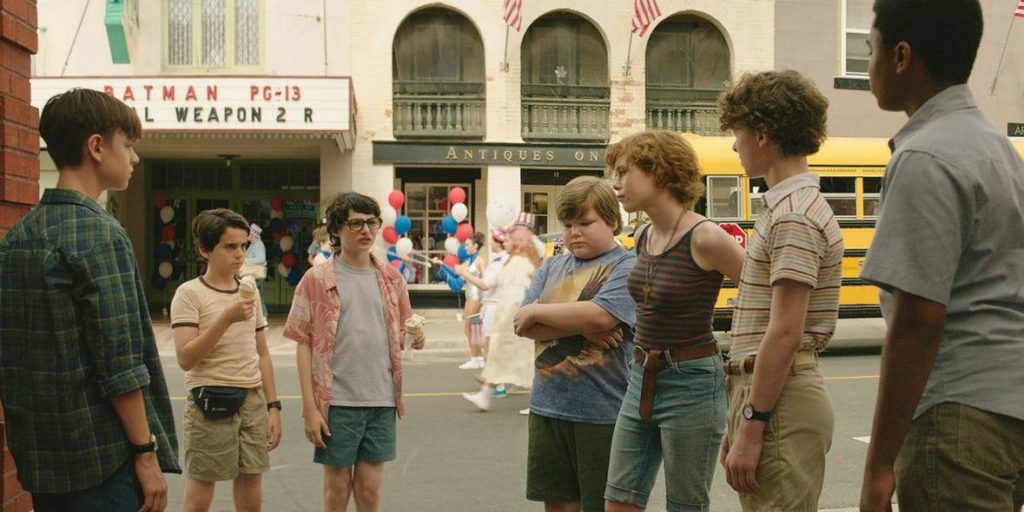
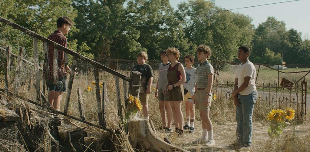
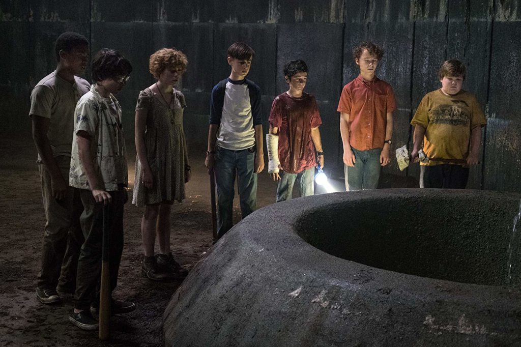
One of the things It does masterfully is having a tight color palette that helps communicate to the audience who’s side the characters are on. The story is couched heavily in the time and location of the events: 1988-89 and summer.
The seven kid characters (Billy, Eddie, Richie, Ben, Beverly, Stanley and Mike) are costumed in a lot of earth tones, with pops of yellow and red. It’s subtle, and you might not notice it at first glance. I am a believer in a tight color palette in costume design. It helps build your world, and often the audience won’t notice what’s not here–namely bright colors and black.
As Bev, Ben and Mike join the group, their costuming shifts to fit in better with the group’s palette and style.
Bev before joining the group…. 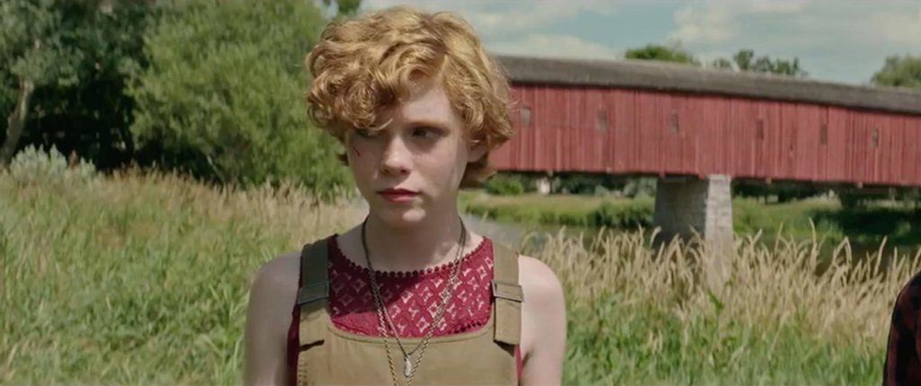
Bev after joining the group
This helps give the audience the understanding that the group is going to stick together.
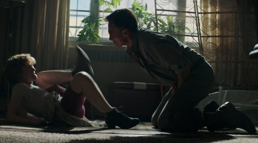
When characters wear a lot of darker hues from head to toe, its generally a sign that they are antagonistic in some way. And usually they are a family member.
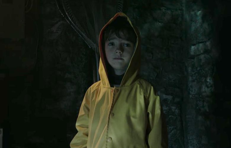
Yellow is a bright color that is used–it pops up in the set and also costuming, but they use it sparingly. When they do use yellow it’s iconic, such as Georgie’s rain coat.
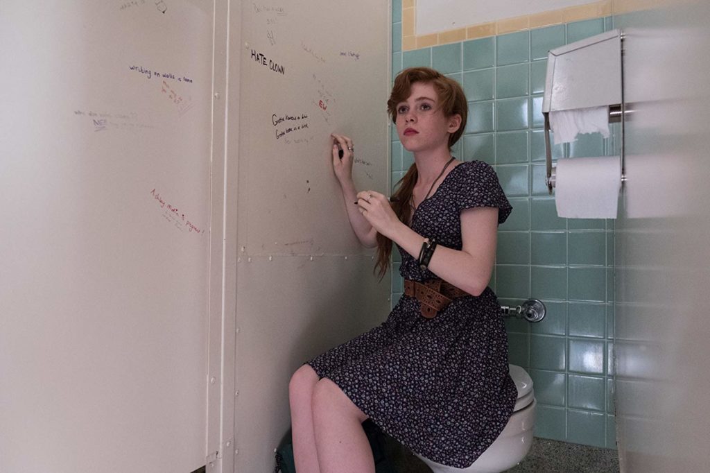
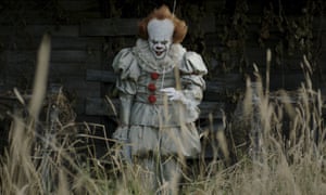
One of my favorite things in It is the costuming of the people who have been taken over by Pennywise. Their costuming subtly (or overtly!) references Pennywise’s costuming.
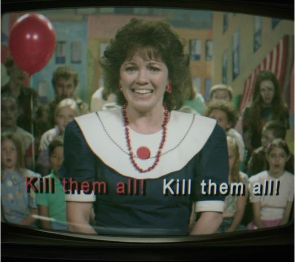
The woman on the TV who’s necklace, collar, and red dot reference Pennywise is such a great, fun choice. The balloon in the background is doing a lot of heavy lifting, and you might not notice her costuming at first glance.
Again with the “trouble” navy…
For the librarian who is suspicious of Ben, it is much more subtle. You can barely see the red dot center on that flower pattern in the dress. Also, nice use of red hair in this one!

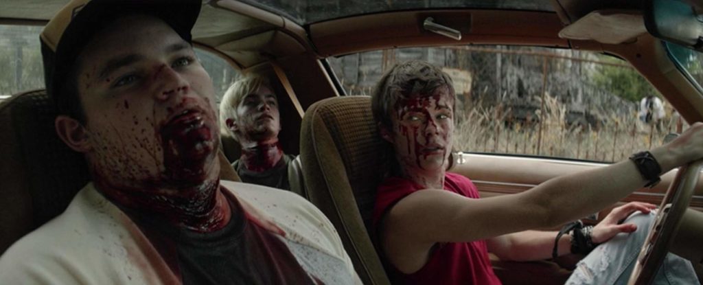
But my favorite example of this is with the character of Henry.
Henry starts out the movie as your tried and true bully. But he’s close to the earth tone palette the rest of the kids are in.

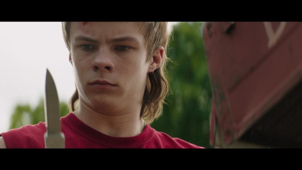
He changes to a red shirt when he starts getting more violent. Not a big deal, and you might not notice it, given the other reds (usually less bright) that the other characters are wearing. You also might not notice that he’s in white pants.
But then they add the blood to his face…and suddenly his costuming is a very strong visual reference to Pennywise, although with an inversion of their primary colors.

I loved the costuming for this movie because it shows how well understated choices can help tell the story. Costumes don’t need to be extravagant to do their job well.
I’m really looking forward to seeing how they costume the adult versions of these characters in It: Chapter Two.